

call me Designer

For the last two weeks, we have been working on visual design and learning how to more efficiently use Affinity Designer. I haven't had much opportunity to flex my visual muscles for the last few years, so this has been a breath of fresh air. When I was in college studying fine art a professor called me a “designer” as a put-down. Since this week that moment replayed in my mind over and over again. So many years later, here I am now trying to live up to the term rather than recoiling away from it in shame.
12/9
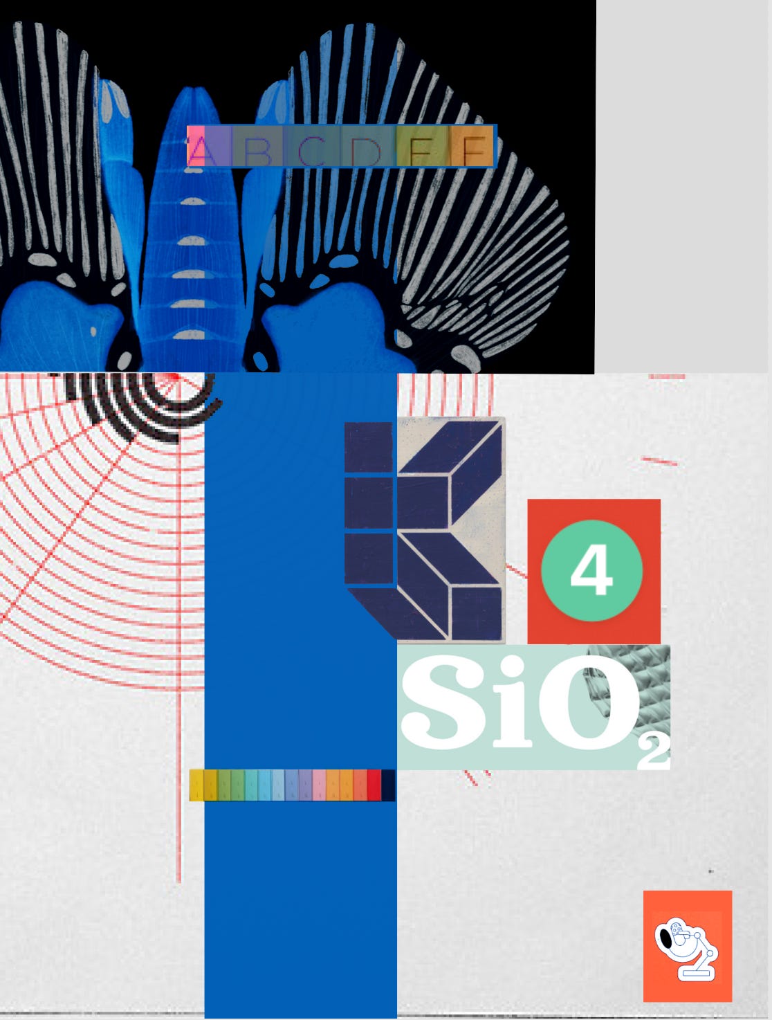
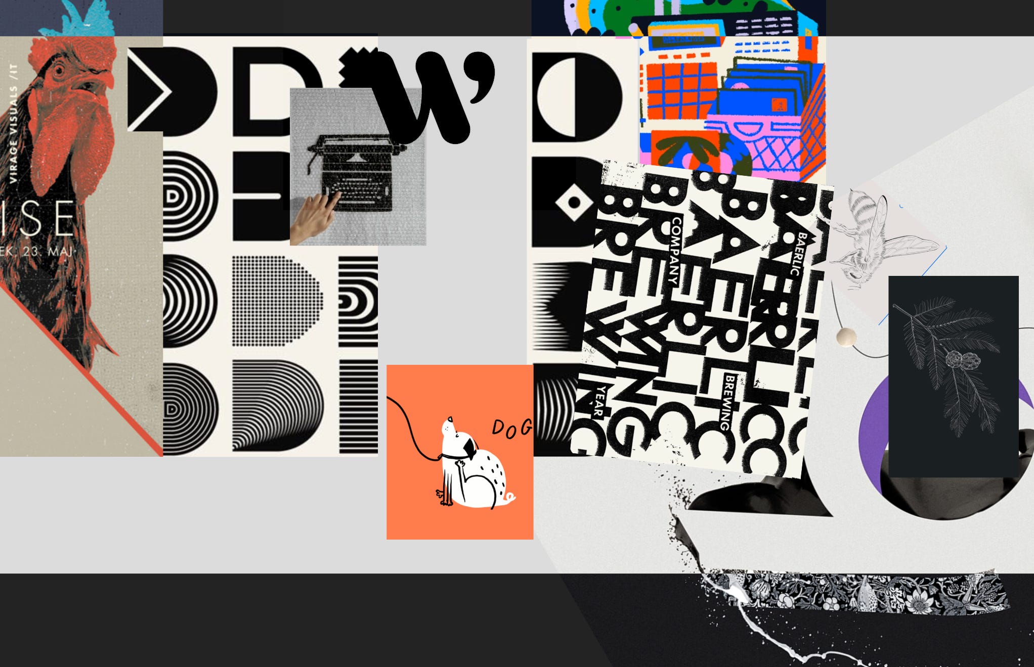
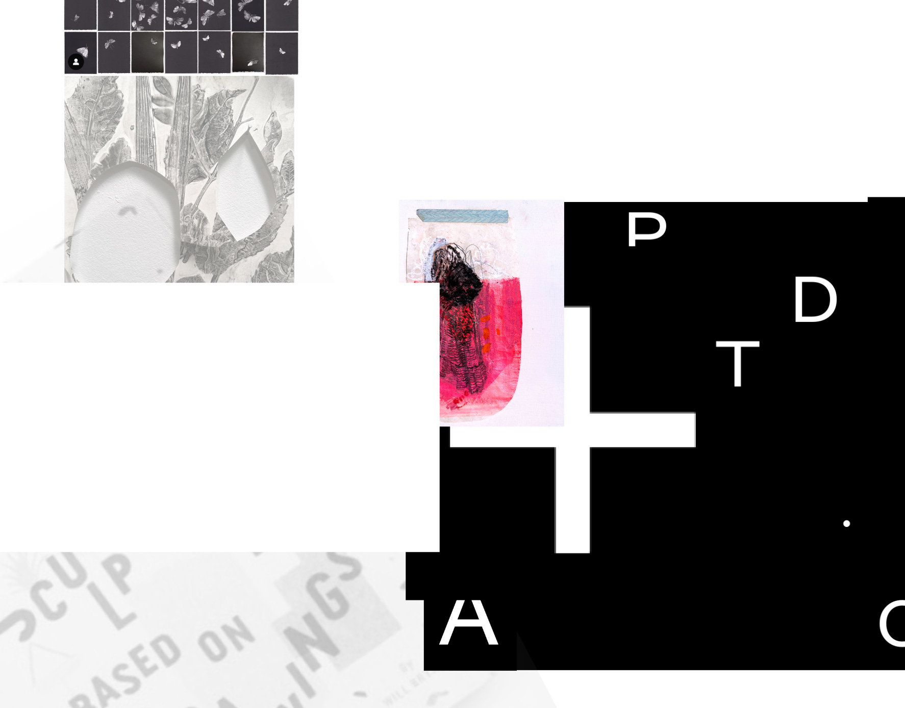
We were tasked with collecting the images we found inspiring or compelling and organizing them into mood boards based on various themes. I love designs that incorporate stark black/white contrast, ovals, rainbows, semicircles, fine lines, detailed illustrations, whimsical doodles, or have an ominous tone.


12/10
This day we started to explore color formally. All color has value, and there are typically two frameworks to determine color relationships:
value
warm and cool
For design, crafting a design based on values makes more sense, as it’s easier for the eye to see. An easy way to spot value relationships between colors is to squint. That will cut most of the hue from your vision, leaving the value relationships easier to understand.
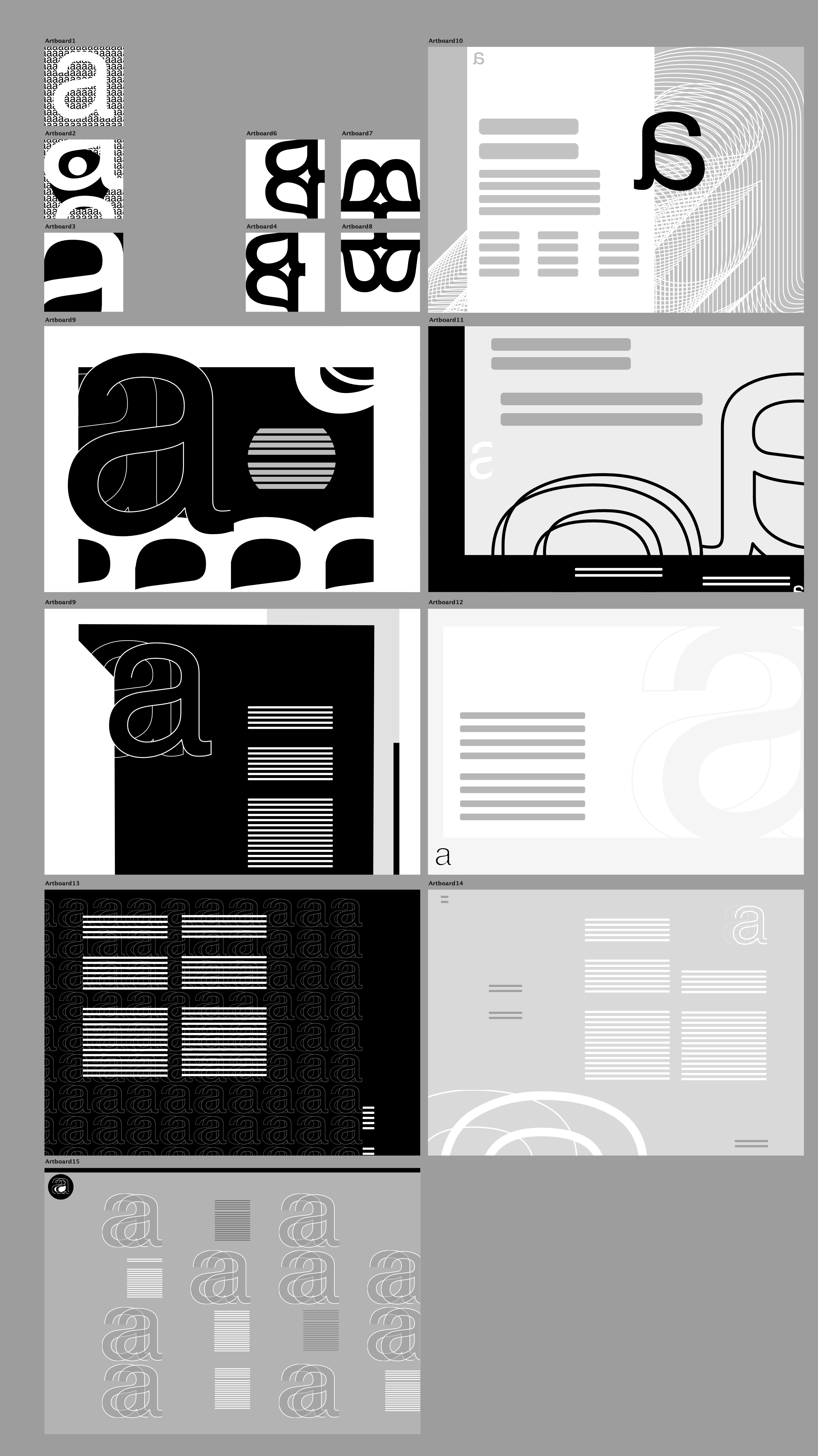
I chose to these ideas within the context of web design by first crafting squares playing with the shape of the letter a, and no greys. Then I moved on to crafting fictitious web layouts only using the letter a but allowing myself a full value range.
12/11
This was a fun day; our lesson left us with a cryptic concept of how to show our understanding of visual spacial relationships. I chose to craft more painterly collages and business cards using only Helvetica to organize the design.


12/9-11
I spent some of the time this week a bit behind, so this project took a couple of days to complete. The goal was to identify the spacial relationship system in a poster and recreate it as a website. This was a fun exercise, and I totally chose this poster because I wanted to make the eye with CSS. Unfortunately, I ran out of time so it’s mostly a SVG.


12/12
Now it was time to refine the process of planning and build a framework to design our personal websites. I took my original collages and boiled them down to a few images to draw a clearer message. At this point, I struggled to keep my site tiles from turning into digital drawings. There are some interesting concepts in these pieces, but when it came to implementing these ideas into my actual site, I was already sick of looking at the pastel colors and couldn’t justify what the design was meant to advertise about me.


I am thoroughly enjoying this process of learning digital design and labeling myself a designer. It’s better to enjoy and create any form of art rather than none at all. If having a creative practice means I am a designer then so be it. I’m ok with that.
This is excellent! So much happening in just one week! Those collages are so cool. We're excited to see how you combine your "art" background with your new "design" outlook. It's going to be awesome.